erm.............................................................. we will let you guys vote for the fonts words/quotes colour etc asap but its exam period dun expect much HAHAS.
the words at the front(bottom picture)..its just an example of the fonts and 2-0-3 or 203? wadever.........stay tuned
Can those sickening assholes stop voting more than once? :D Its creating alot of problems for those who are in charge of the class tee. If you don't want to take up responsibilities, then stop creating trouble.
we're geting one thats for sure.but i just hope you all will cooperate. vote hor. we will just take down the results after a week. and the colour will be then decided. we really need to make theclass tee fast, so that it will be worth your money, as you only would wanna wear your class tee only when you all are sec two and not sec 3 alright? oh an i did not ADD THE COLOUR BLACK BECAUSE ITS COMMON, AND IT SO MAKE YOU FEEL LIKE MELTING UNDER THE SUN!
YOU ARE VOTING BECAUSE YOU WANT YOUR COLOUR TO BE ON THE TEE
Hello cows. Holy mama, this blog had been dead a little while. But it has been revived! :D
Anyway, I just wanted to post the comments of the class tees here. Cause I had a little too many opinions. & it'll really mess the tagboard up.
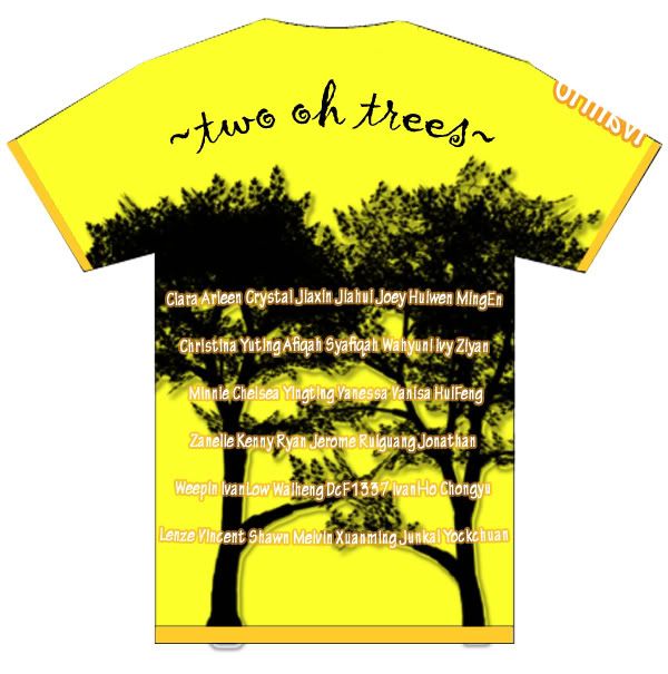
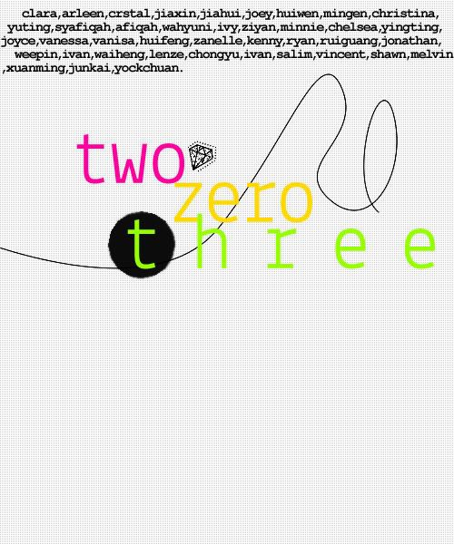
Okay, like what I said in the tagboard, I think the name at the shoulder should be ok. I thought it was really creative. At least IvanHo uses his brains! :D Back to the topic. Most probably Minnie'll have to change the font, cause it doesn't really suit. [ no offence yo. ] Secondly, she chose yellow cause it looks nice on her. :] &also perhaps cause IvanHo chose yellow as well ? :/ Thirdly, I think it depends on the class.
I just hope you all can all post your comments and opinions for them to change into the nicest tees they can, before letting you guys vote for either one. I think its only fair they both have a chance. You all can create more designs as well, maybe others will like it? o.o
ALL THESE BELOW ARE MY COMMENTS ALRIGHT. NO OFFENCE MEANT. Overall, I'd prefer Minnie's, but not because I'm bias to her because we're a clique. It's cause I find hers more lively. But, it's a LITTLELITTLE plain at the back. Even little raindrops might do, since the front is filled with umbrellas! :D However, the font really has to change. It doesn't fit the kiddokiddo mood. Y'know. No offence, I really appreciate your hard work, well done! :]
For IvanHo's, I think it pretty alright, except for the 'two oh trees' font. and the '203' font. Other than that, it's quite ok. But the black trees only display salim as our mascot! :X HAHAH, kidding yo.
That's all luhh, but I think you can combine your works together and get a totally perfect tee. Mix & match, I think it'll work out fine. & thank the both of you for taking time off to design. :D You're all greatly appreciated. That's all. Sorry for the damn long naggy post.
& one more disclaimer, just shut the fuck up about kenny alright. zzz. it's fucking irritating lah.

 erm..............................................................
 front ;